Maximum Temperature

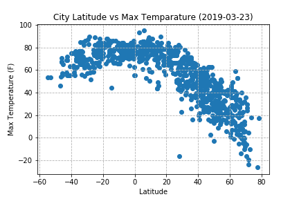
This graph shows a clear relationship Maximum Temperature and Latitude. Cities with latitudes close to 0 tend to have higher Maximum Temperatures the cities farther from the equator. The asymmetry seen in the plot is due to lower number of cities in the southern hemisphere compared to the northern hemisphere.


